ShopDreamUp AI ArtDreamUp
Deviation Actions


Suggested Deviants


Suggested Collections


You Might Like…


Featured in Groups


Description
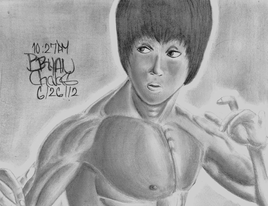
My second attempt at realistic drawing, and first attempt at Bruce Lee.
Image size
6458x4958px 4.25 MB
© 2012 - 2024 BryanChalas
Comments18
Join the community to add your comment. Already a deviant? Log In
Well this is a lovely you have created.<img class="avatar" src="a.deviantart.net/avatars/s/m/s…" alt="
 " title="smilieplz"/> The critique will be set up into PROS, CONS, and OVERALL REVIEW of the picture. I am very happy to be critiquing this awesome piece of art~.<img class="avatar" src="a.deviantart.net/avatars/y/a/y…" alt="
 " title="yayitaliaplz"/>
------------------------------------------------------------------------
PROS:
<img class="avatar" src="a.deviantart.net/avatars/p/i/p…" alt="
 " title="pinksparkleplz"/>
BRUCE LEE: You did a great job on capturing the martial artistic tone that Lee could create. I know where this stance is from you nailed how the body was formed to show his concentration and alertness.
The hair looks pretty good. I see you took time to draw those little slivers to show natural hair follicles at his forehead and the side of his face, instead of make big chunks of bangs with no individual loose hairs.
TECHNIQUE: The shading is nicely done on some areas, like the nose. It really shows a 3-dimensional look. Also with the muscles. They show that looks of being glossy and sweaty from fighting very nice. The idea to leave that white around the contours of Lee's body was a great move. This shows a feeling of power and a shining aura from this martial arts master against the darker background(assuming it is a wall).
------------------------------------------------------------------------
CONS:
BRUCE LEE<img src="e.deviantart.net/emoticons/f/f…" width="15" height="15" alt="
TECHNIQUE: Some of shadow areas should be a bit darker to show a deeper shadow from the rest of him.
------------------------------------------------------------------------
OVERALL REVIEW:
You did a nice job on this piece. It really shows your artistic abilities. Though you have very minor errors.
VISION: 4 STARS
ORIGINALITY: 4 STARS
TECHNIQUE: 4 STARS
IMPACT: 5 STARS